The R ecosystem offers several excellent packages for creating data visualizations. However, plots created with different packages cannot be combined. Therefore, we have to decide on a plotting package before creating a visualization.
The graphics package is also known as the base plotting system. It is part of R and does not need to be installed separately. The base plotting system is very well suited for quick visualizations – and with some additional effort, you can also create beautiful graphics for publications.
The following examples use the airquality dataset included in R (a brief description is available in ?airquality):
str(airquality)
'data.frame':   153 obs. of  6 variables:
 $ Ozone  : int  41 36 12 18 NA 28 23 19 8 NA ...
 $ Solar.R: int  190 118 149 313 NA NA 299 99 19 194 ...
 $ Wind   : num  7.4 8 12.6 11.5 14.3 14.9 8.6 13.8 20.1 8.6 ...
 $ Temp   : int  67 72 74 62 56 66 65 59 61 69 ...
 $ Month  : int  5 5 5 5 5 5 5 5 5 5 ...
 $ Day    : int  1 2 3 4 5 6 7 8 9 10 ...
The plot() function
One of the most important functions in the base plotting system is plot(). This function creates appropriate visualizations depending on the data to be displayed.
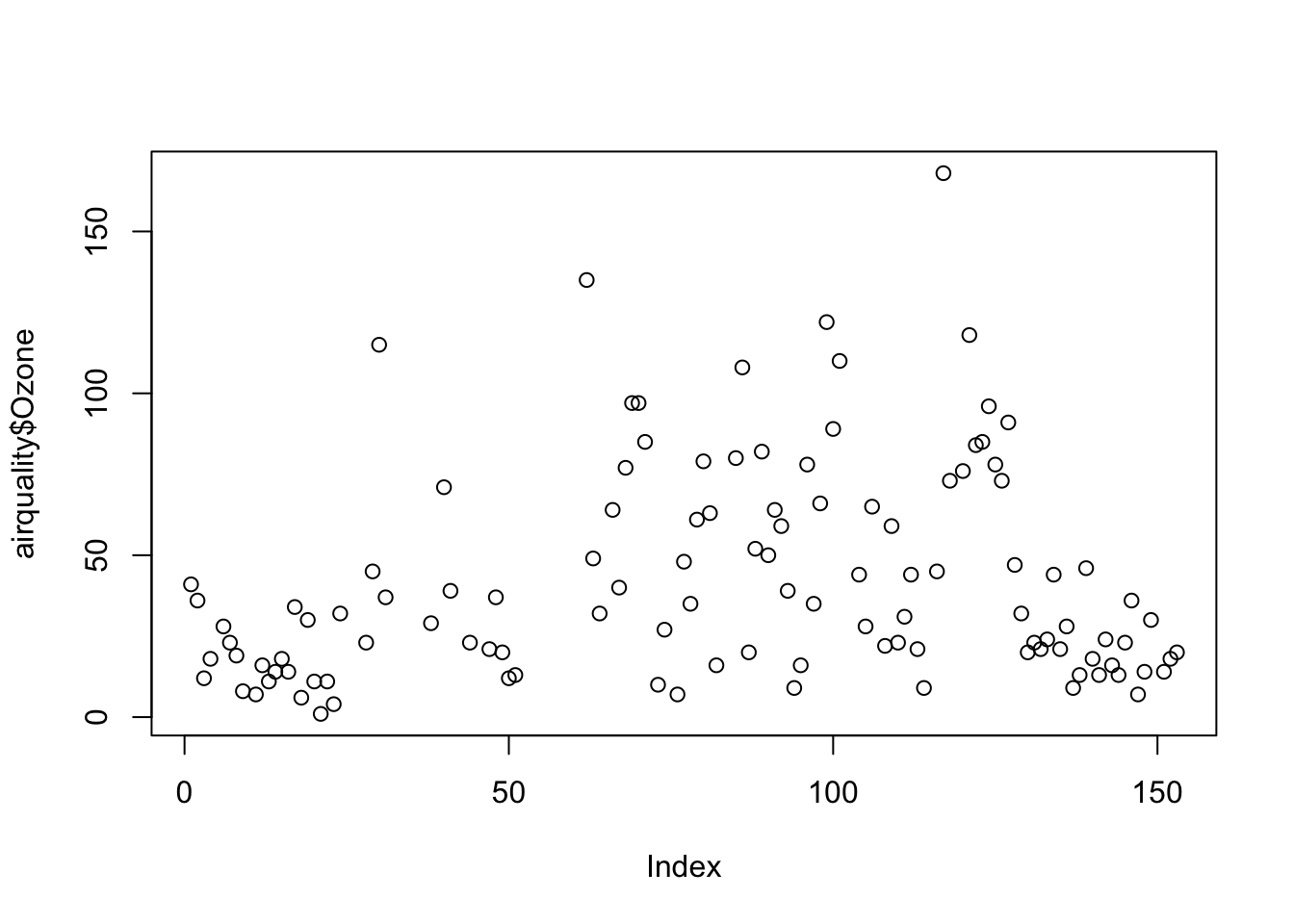
If you pass a numerical vector, the function produces a dot plot. The x-axis shows the index of the data points, and the y-axis shows the data values:
plot(airquality$Ozone)
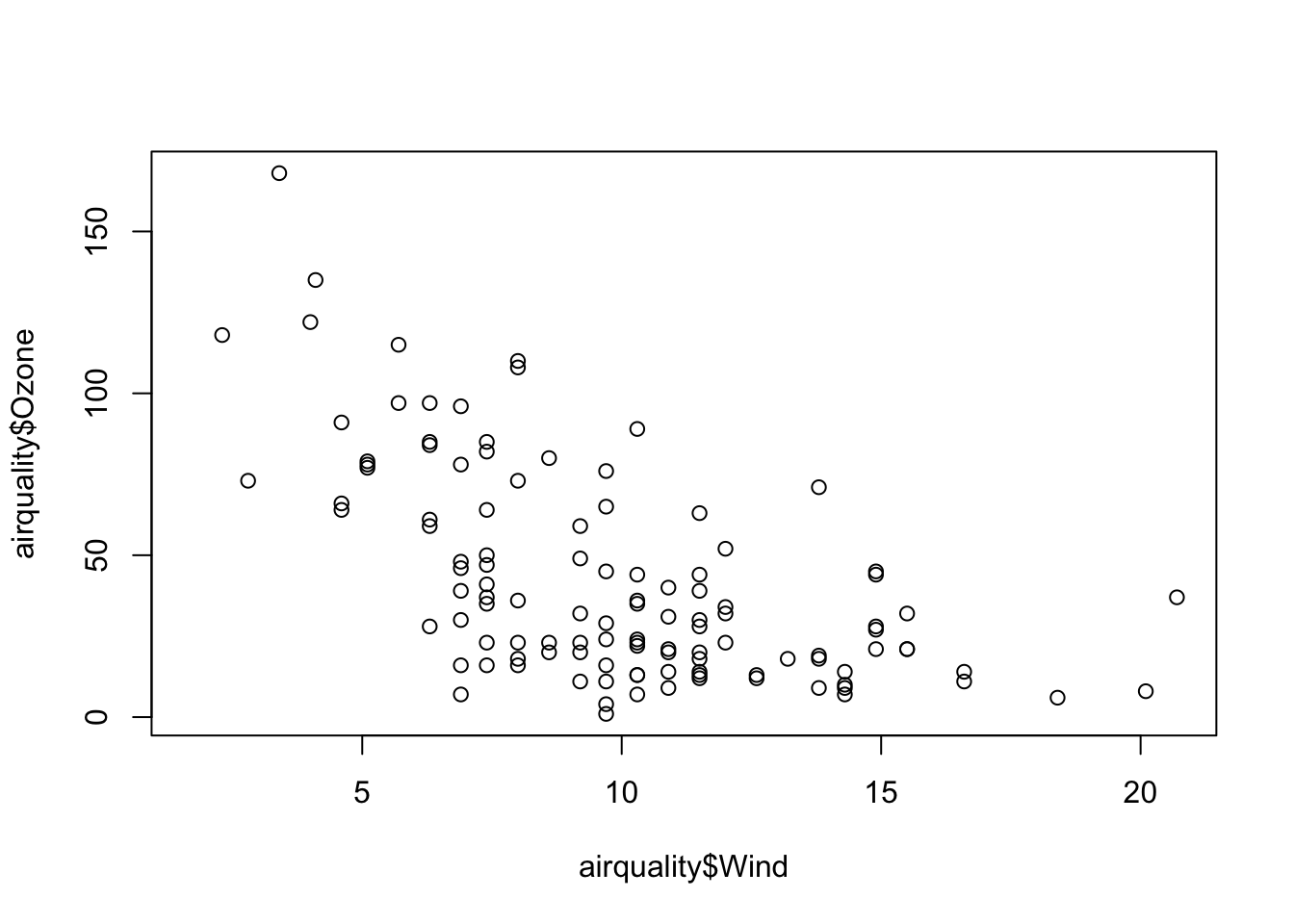
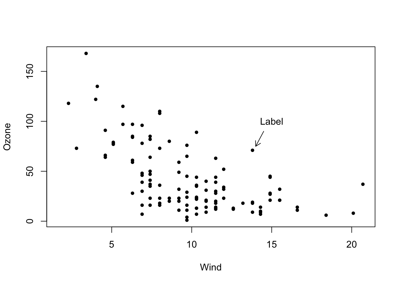
If you pass two numerical vectors, you get a so-called scatter plot. The first argument is displayed on the x-axis, and the second argument is displayed on the y-axis:
plot(airquality$Wind, airquality$Ozone)
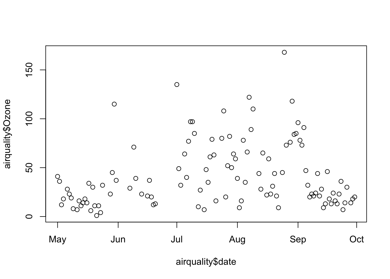
The function can also handle date values. First, let’s create a new column named date from the columns Month and Day (from the data description, we know that these were recorded in 1973):
This vector can then be converted into a date vector using the as.Date() function with the argument format="%m %d %Y", which we assign to the date column in the data frame:
class(airquality$date)
[1] "Date"
Now we can use this date column for the x-axis. In this example, the names of the five months are automatically displayed on the x-axis:
plot(airquality$date, airquality$Ozone)
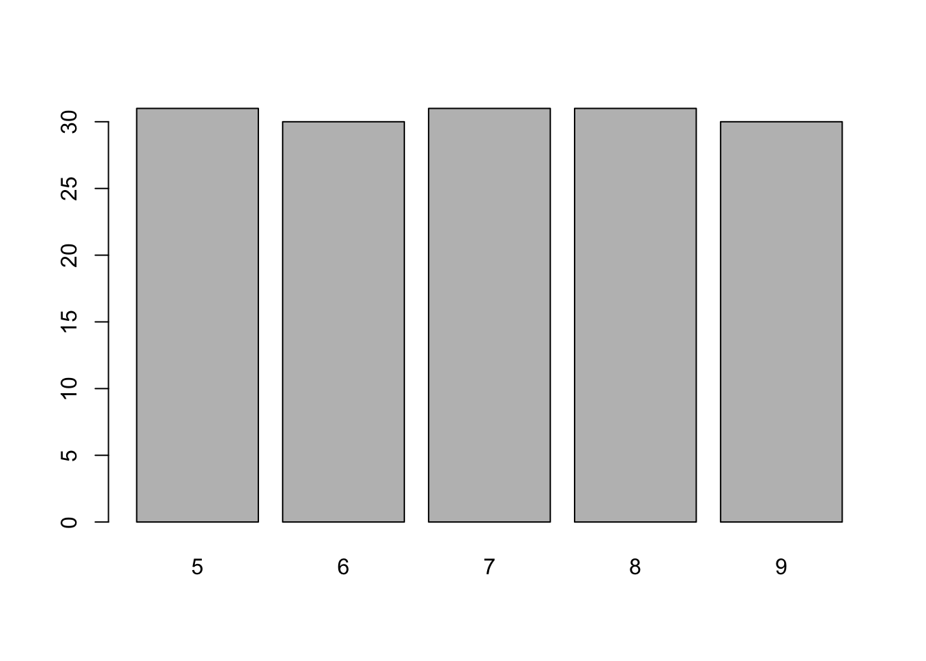
If you pass a factor to the function, you get a bar chart with the frequencies of the individual levels:
plot(factor(airquality$Month))
Histograms
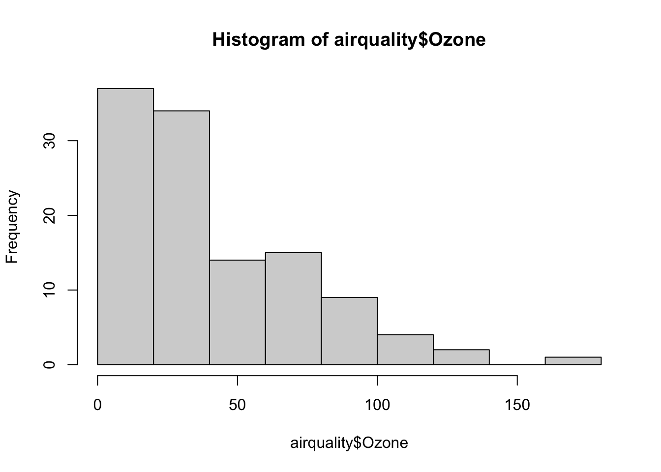
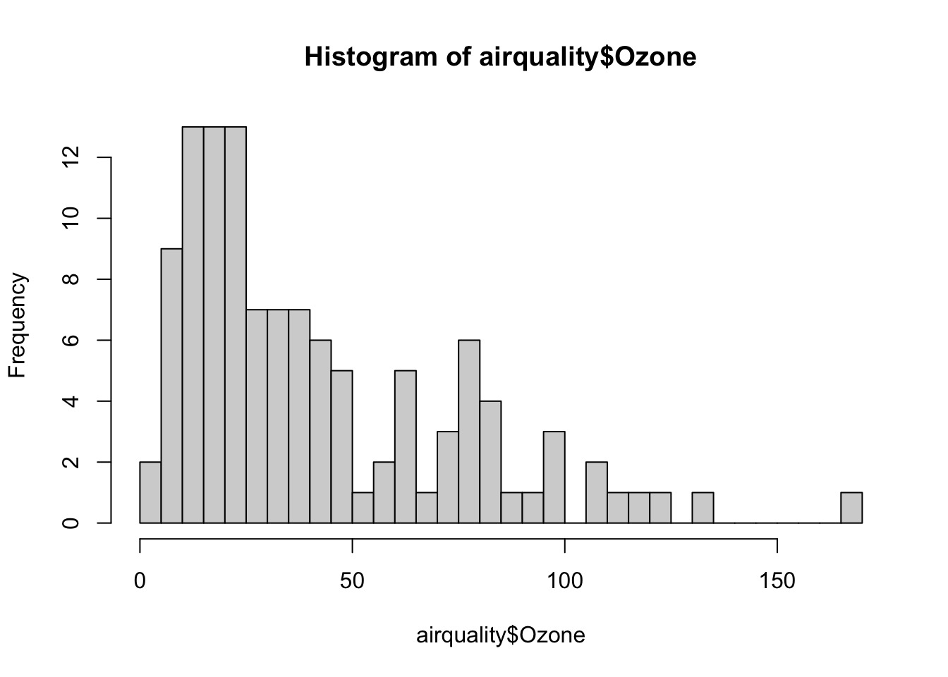
The hist() function creates a histogram of a vector:
hist(airquality$Ozone)
A histogram visualizes the distribution of the values in a vector. You can explicitly set the number of bins in the histogram with the breaks argument:
hist(airquality$Ozone, breaks=30)
Note
The breaks argument is only a recommendation – the actual number of bins is adjusted to keep the plot readable.
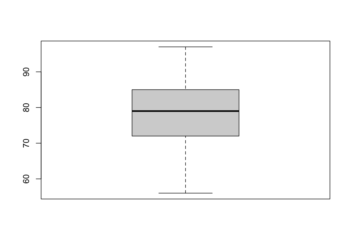
Boxplots
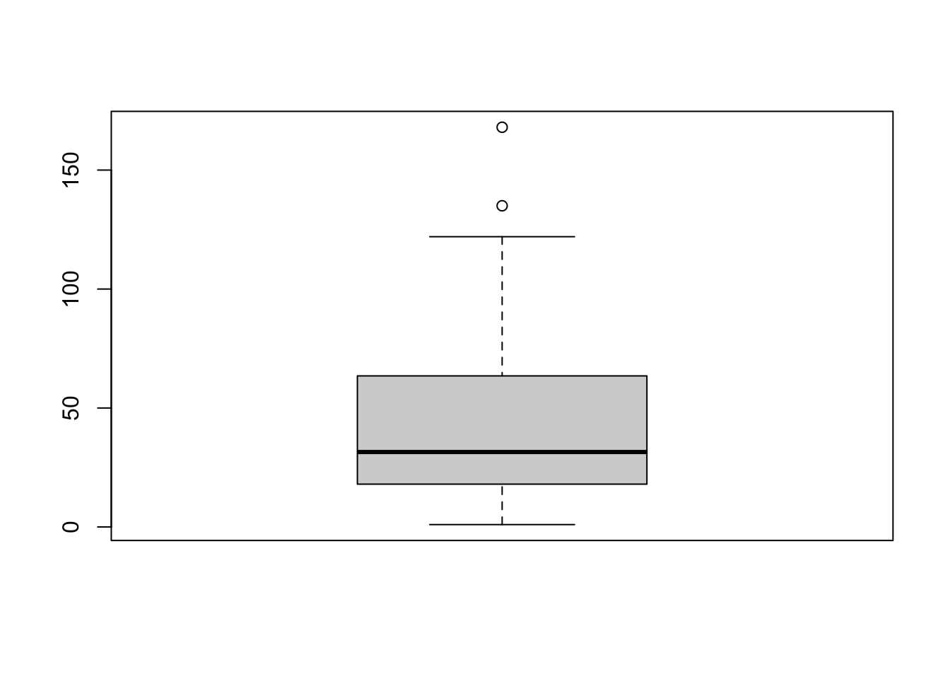
Another way to graphically represent the distribution of values is the boxplot() function. A boxplot shows the median, the interquartile range (IQR), as well as the minimum and maximum (plus any outliers) of the data. Here is an example of a boxplot for the Temp column:
boxplot(airquality$Temp)
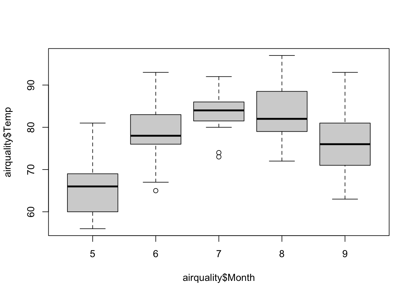
A single boxplot is relatively uninformative. If you pass a formula instead of a vector, you can create multiple boxplots in a single graph.
Note
A formula in R is defined by the tilde character (~) with expressions on its left and right sides. An example of a formula is y ~ x with y on the left side and x on the right side. The meaning of a formula depends on the specific function. Many functions require formulas as arguments, and we will use formulas extensively when calculating linear models.
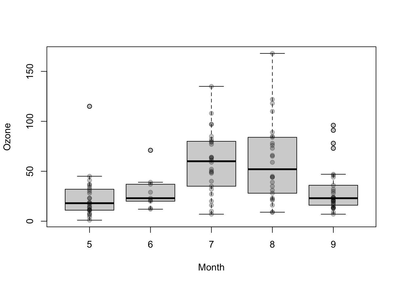
The following example creates boxplots for airquality$Temp separately for all levels of airquality$Month:
boxplot(airquality$Temp ~ airquality$Month)
In this case, the left side of the formula determines the values on the y-axis, and the right side determines the values on the x-axis.
Adjusting plots
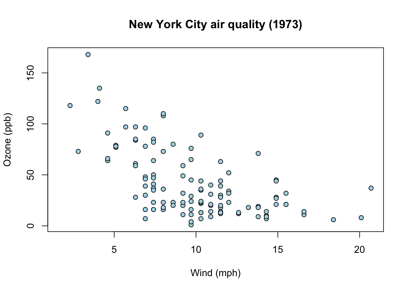
Often, we need to adjust various plot properties, such as the line type, colors, symbols, titles, axis labels, and so on. Many parameters can be passed as arguments when creating the graphic. An adapted version of the previous scatter plot example is:
plot( airquality$Wind, airquality$Ozone,xlab="Wind (mph)", # x-axis labelylab="Ozone (ppb)", # y-axis labelmain="New York City air quality (1973)", # titlepch=21, # circle with borderbg="lightblue"# background color)
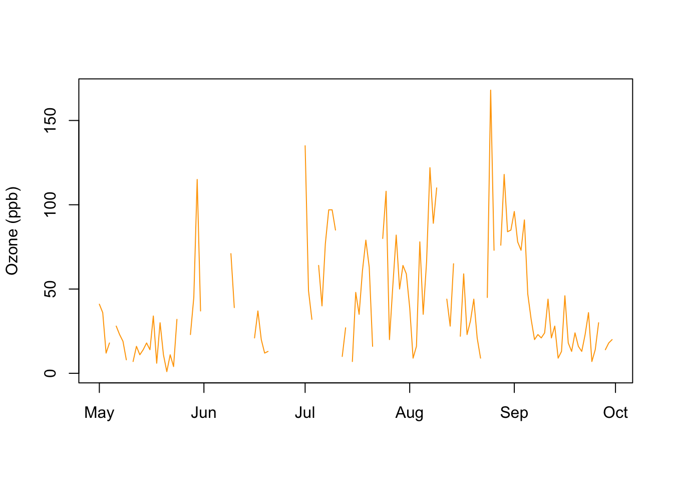
We can improve the visualization of the ozone values over time by setting the following arguments (here, the type argument specifies the plot type; in this example, we set it to "l", which corresponds to a line plot):
plot( airquality$date, airquality$Ozone,xlab="",ylab="Ozone (ppb)",main="", # no titletype="l", # line plotcol="orange")
This line plot also clearly shows missing values in the data (where the line is interrupted).
The various plot functions have many common parameters that can be used to influence the appearance of the plots. In the previous examples, we adjusted the following parameters:
The par() function can be used to query or globally set all relevant parameters (the documentation ?par provides a description of all supported parameters). If you call this function without arguments, you get the current values of all graphical parameters. You can also globally change individual parameters, i.e., after a change, new plots will always be created with the new parameters.
The following example demonstrates the use of par(). First, we query the current value of the col parameter (i.e., the color). This works with the $ notation (which is similar to extracting columns from a data frame):
par()$col
[1] "black"
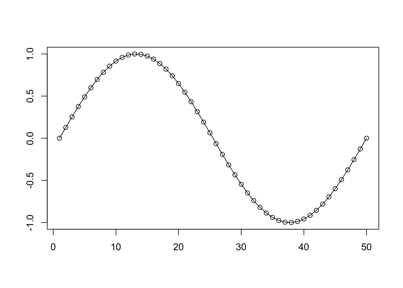
We can observe that the color is set to black. This is also confirmed by a small example plot, which consists of black elements by default:
Before creating additional plots, we will reset the color to black:
par(col="black")
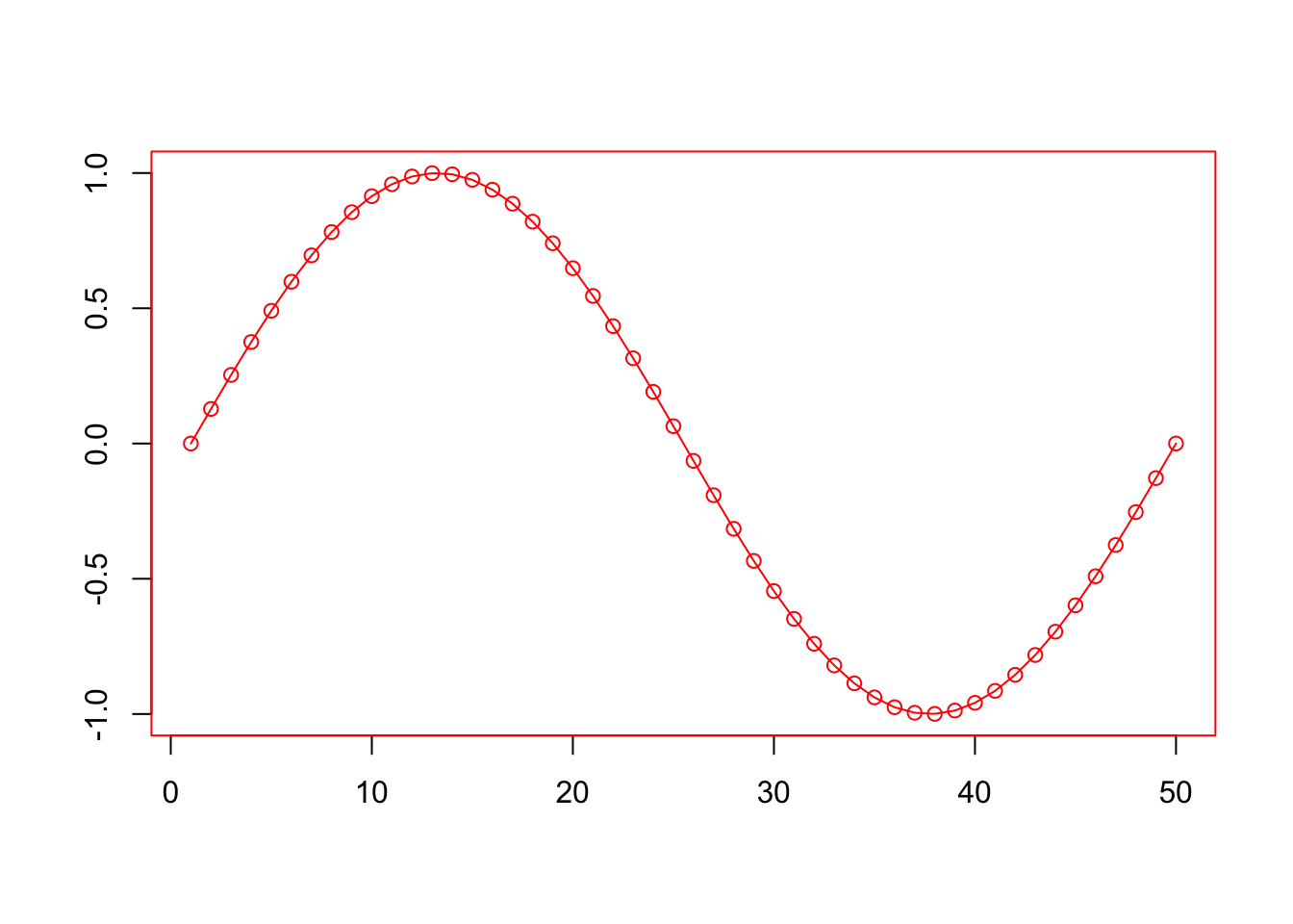
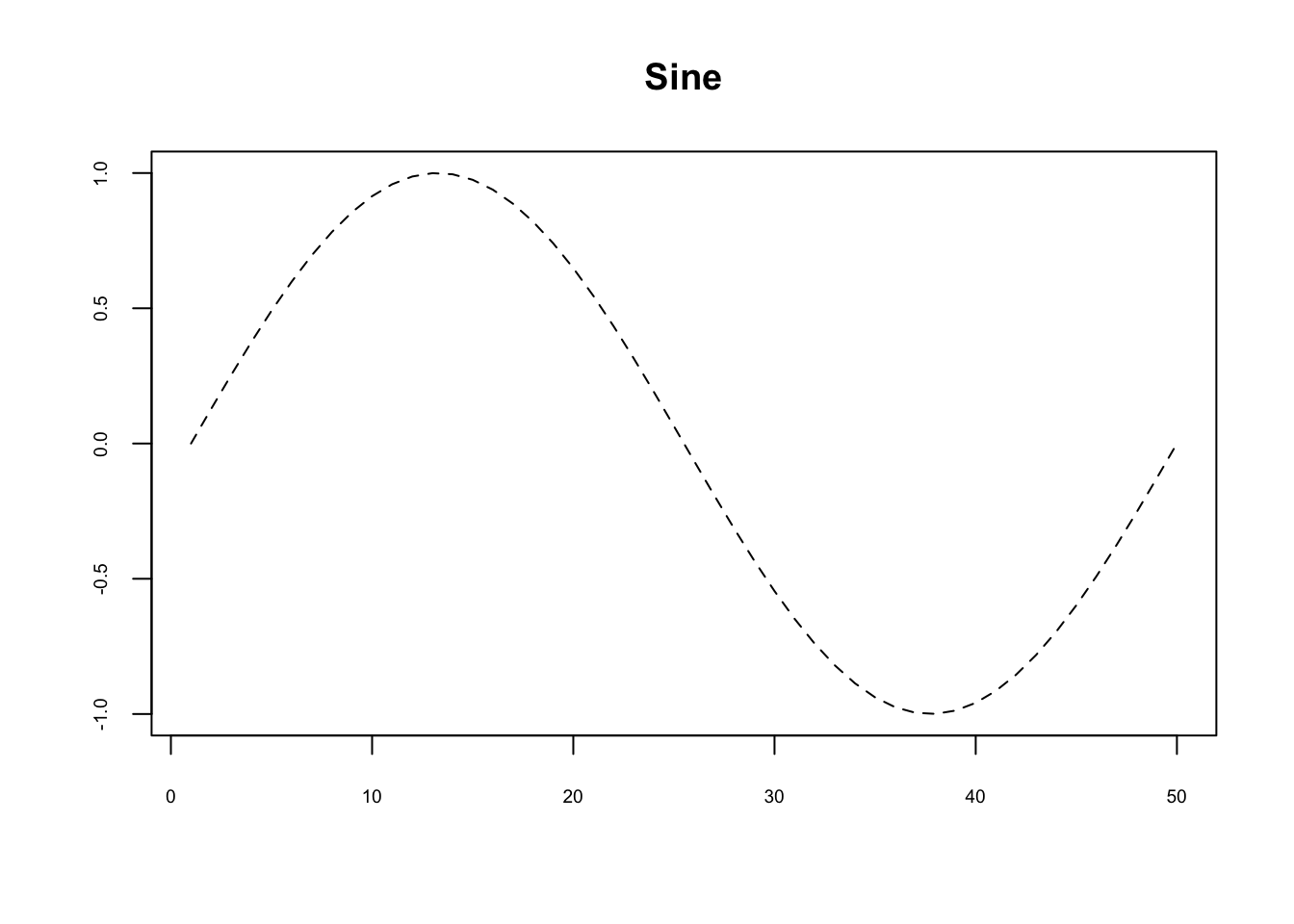
Other commonly used parameters include lty (line type) and cex.axis (size of the axis labels):
plot(sin(seq(0, 2*pi, length.out=50)),type="l",xlab="",ylab="",cex.axis=0.6, # axis label sizelty=2, # line typemain="Sine")
The following line types are possible values for lty:
lty
Type
0
empty (no line)
1
solid (default)
2
dashed
3
dotted
4
dot–dash
5
long dash
6
short dash–long dash
The documentation of the points() function lists all available symbols for pch. The cex.axis parameter sets a scaling factor for the axis label; by default, this is 1 – values less than 1 reduce the axis label, values greater than 1 enlarge it.
Adding elements to plots
The base plotting system allows us to create a plot and then add additional graphical elements. To do this, we use specific functions that we will discuss below.
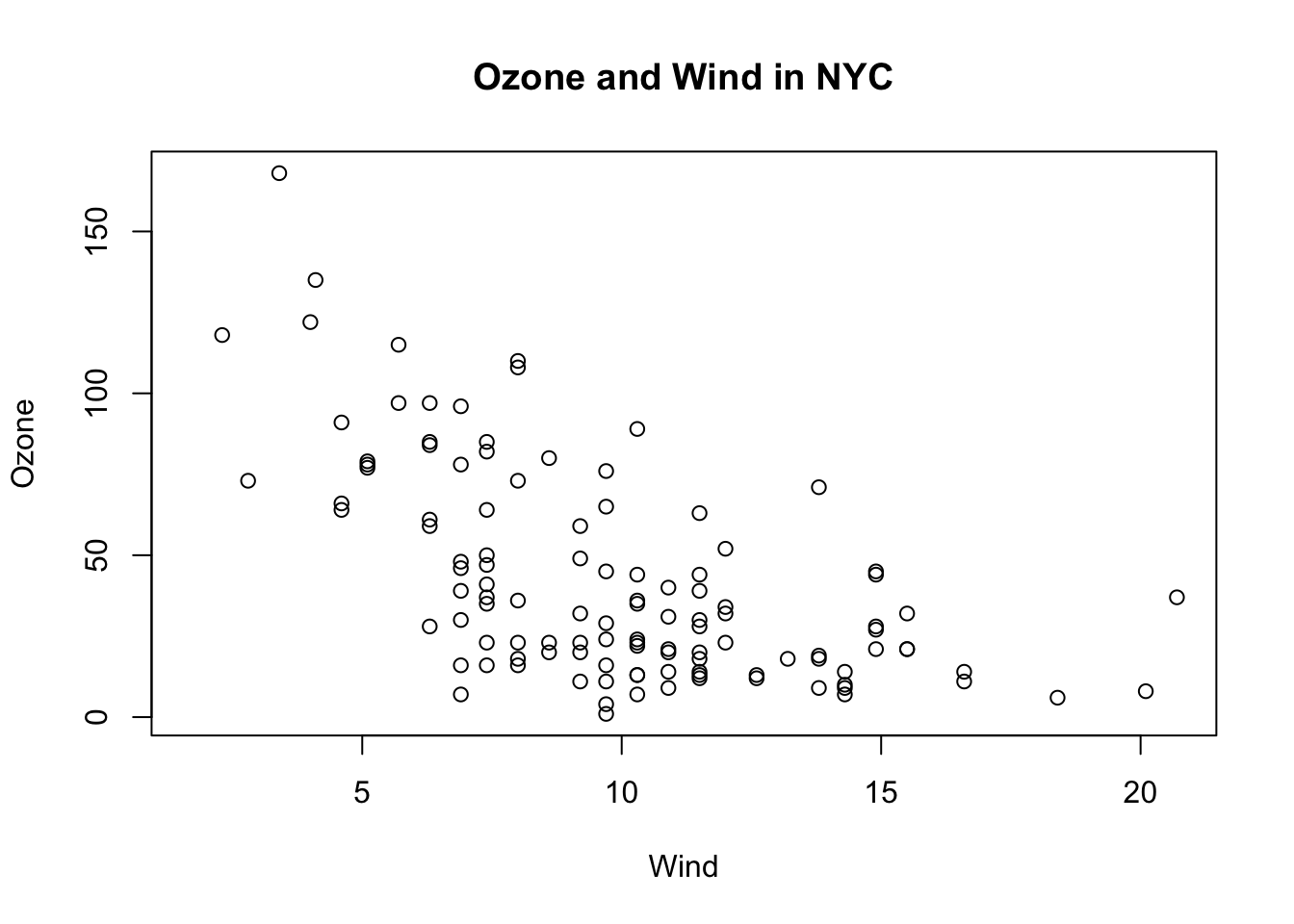
We can add a title with title():
with(airquality, plot(Wind, Ozone))title(main="Ozone and Wind in NYC")
Tip
This example also uses the with() function. This function allows us to use column names from a data frame directly within the parentheses. For example, instead of airquality$Ozone, we can write Ozone. This means that the first line of the example is equivalent to plot(airquality$Wind, airquality$Ozone). However, note how the default axis labels depend on the x and y arguments!
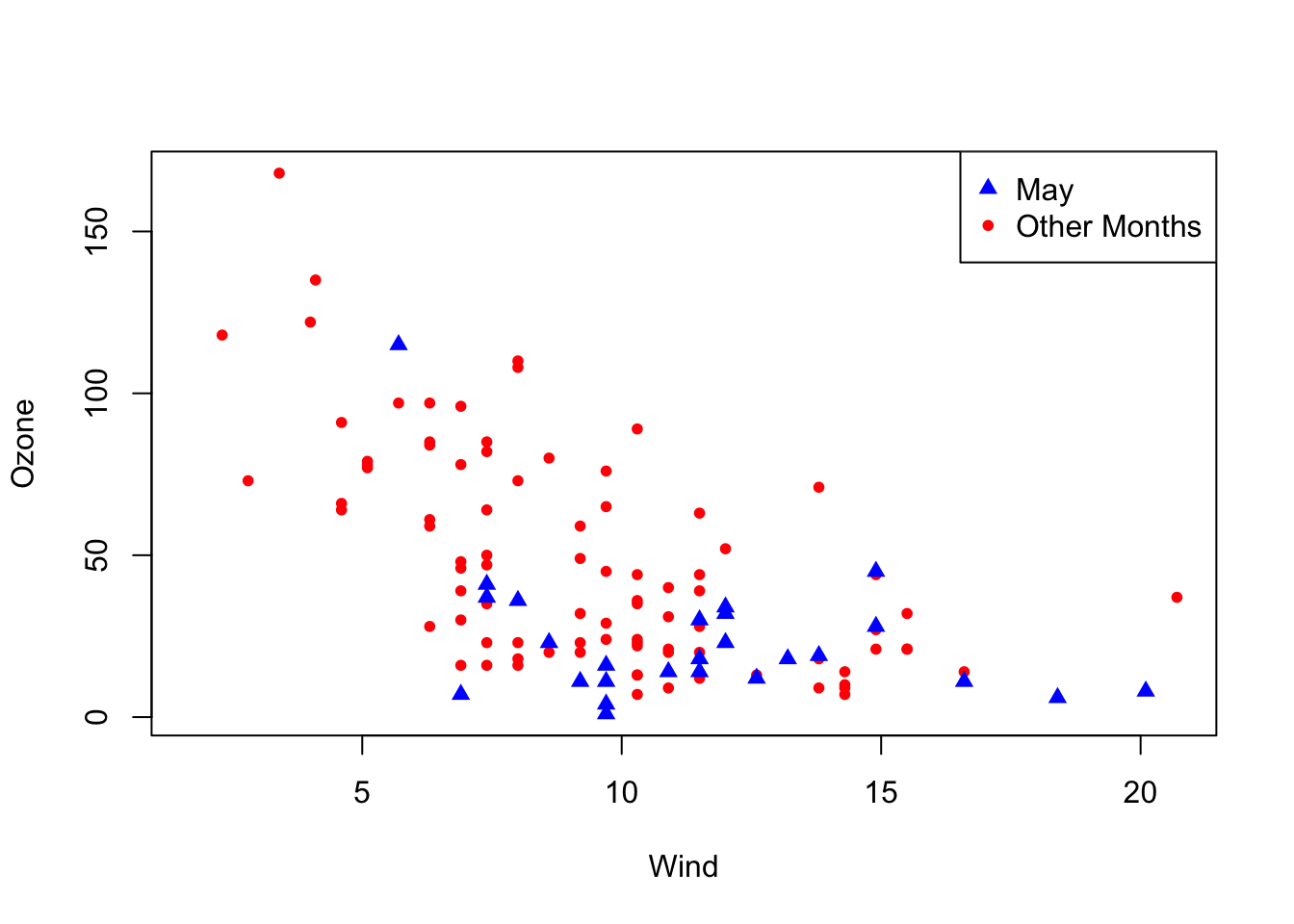
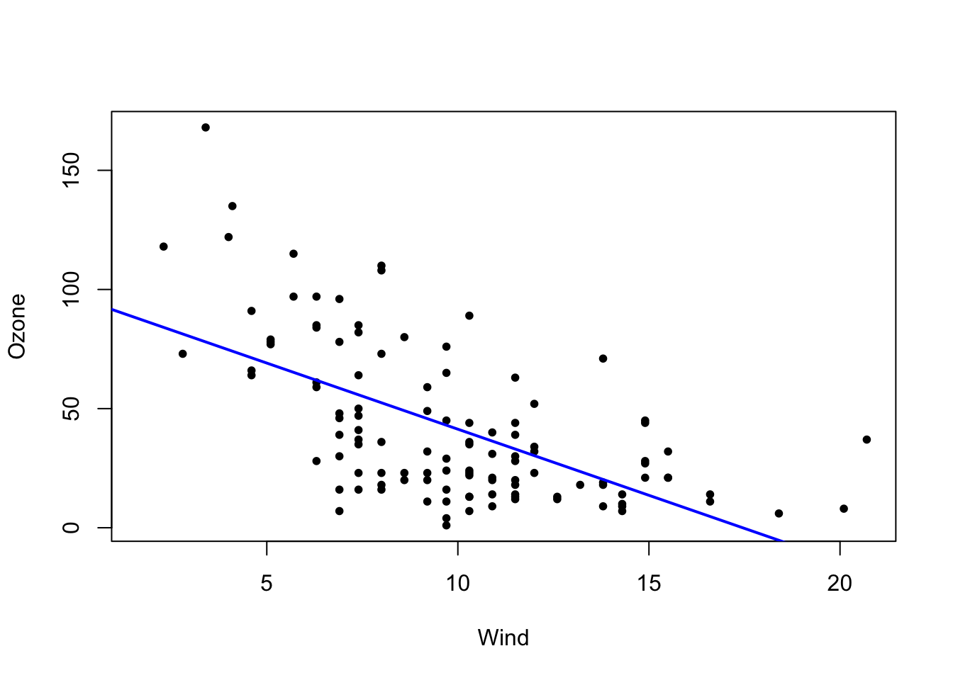
We can add points with points(). This can be used, for example, to display groups of data in different colors. We start with an empty plot (type="n") and then add points with different colors and symbols. The legend() function adds a legend:
Here, we pass the line as a linear model computed by lm(), which we will learn more about later in this course. For now, it is sufficient to know that this function expects a formula of the form y ~ x, where you specify the column names corresponding to the x and y axes.
We can add text and arrows with text() and arrows(), respectively:
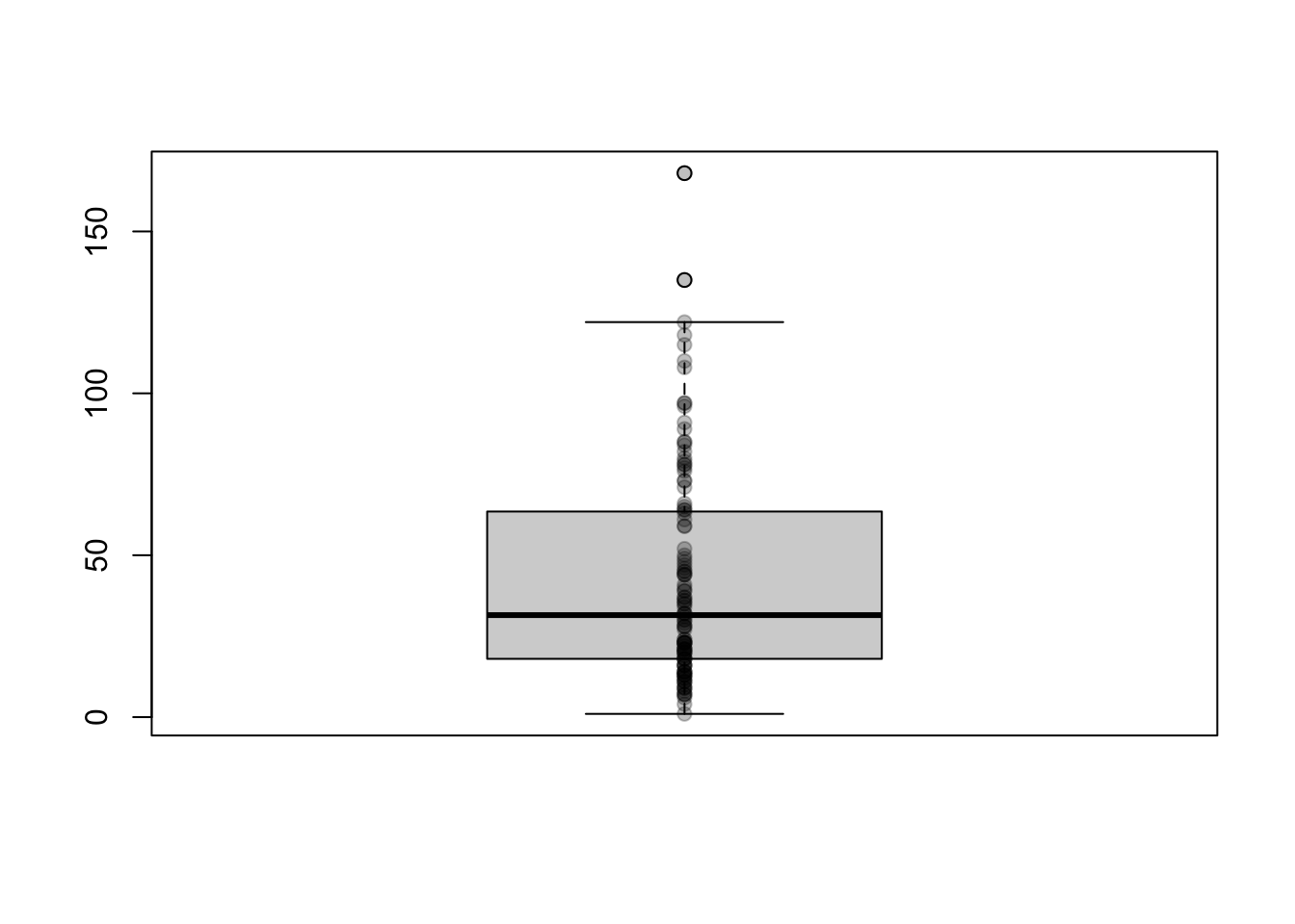
There are many ways to visualize the distribution of a (numerical) variable (e.g., histograms and boxplots). In principle, you should always display the raw data in the plot in addition to summary statistics (such as mean, median, dispersion, and so on). This is possible with the stripchart() function.
Let’s take the airquality$Ozone column as an example. You could display only its mean in a bar chart, but this would not be very informative:
barplot(mean(airquality$Ozone, na.rm=TRUE))
A boxplot would be slightly better:
boxplot(airquality$Ozone)
The best option is to include the raw data in the plot with the stripchart() function:
Note that add=TRUE must be passed if you want to add the points from stripchart() to an existing plot (otherwise, the function creates a new plot). You could make further improvements here, such as jittering the points a little with method="jitter".
Here is a complete example with boxplots for each month and the underlying raw data:
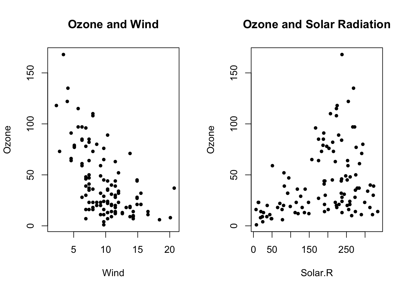
We can display multiple plots side by side (or in any rectangular grid) using the global mfrow or mfcol parameters. Specifically, we set the desired parameter to a vector with two elements, which indicates the number of rows and columns to reserve for subsequent plots. For example, mfrow=c(3, 2) corresponds to three rows and two columns, resulting in a total of six plots. Then we can create the corresponding number of plots with various functions such as plot(), hist(), boxplot(), and so on. We use mfrow if we want to fill the grid row by row or mfcol if we want to fill it column by column.
par(mfrow=c(1, 2)) # 1 row, 2 columnswith(airquality, plot(Wind, Ozone, main="Ozone and Wind", pch=20)) # plot 1with(airquality, plot(Solar.R, Ozone, main="Ozone and Solar Radiation", pch=20)) # plot 2
Once the plots are complete, it is advisable to reset the global parameter so that the next plot consists of a single visualization:
par(mfrow=c(1, 1))
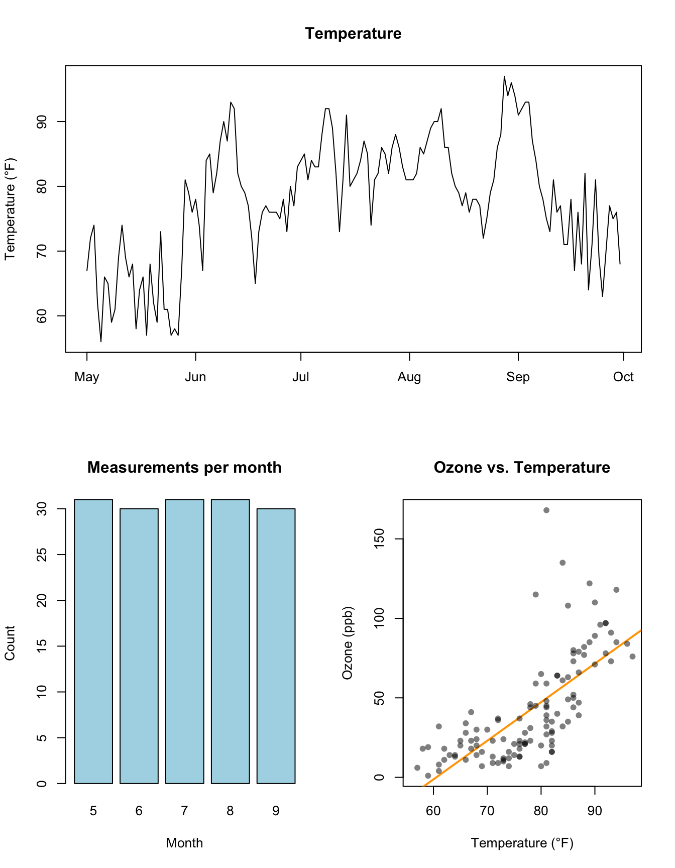
We can also use the layout() function to create more complex layouts. Here, we specify a matrix that contains the identifiers of the plots to be displayed. For example, to display three plots in two rows and two columns, with the first plot spanning both columns in the first row, we define the matrix as follows:
Specifying the color as col=rgb(0, 0, 0, 0.5) in the last example defines the color black using the first three values (RGB, i.e., red, green, and blue) and the transparency using the fourth value (1 means opaque and 0 means completely transparent – 0.5 is therefore semi-transparent).
After creating the plot, you should reset the parameter, either as shown above with par(mfrow=c(1, 1)) or with:
layout(1)
Extending base plotting with tinyplot
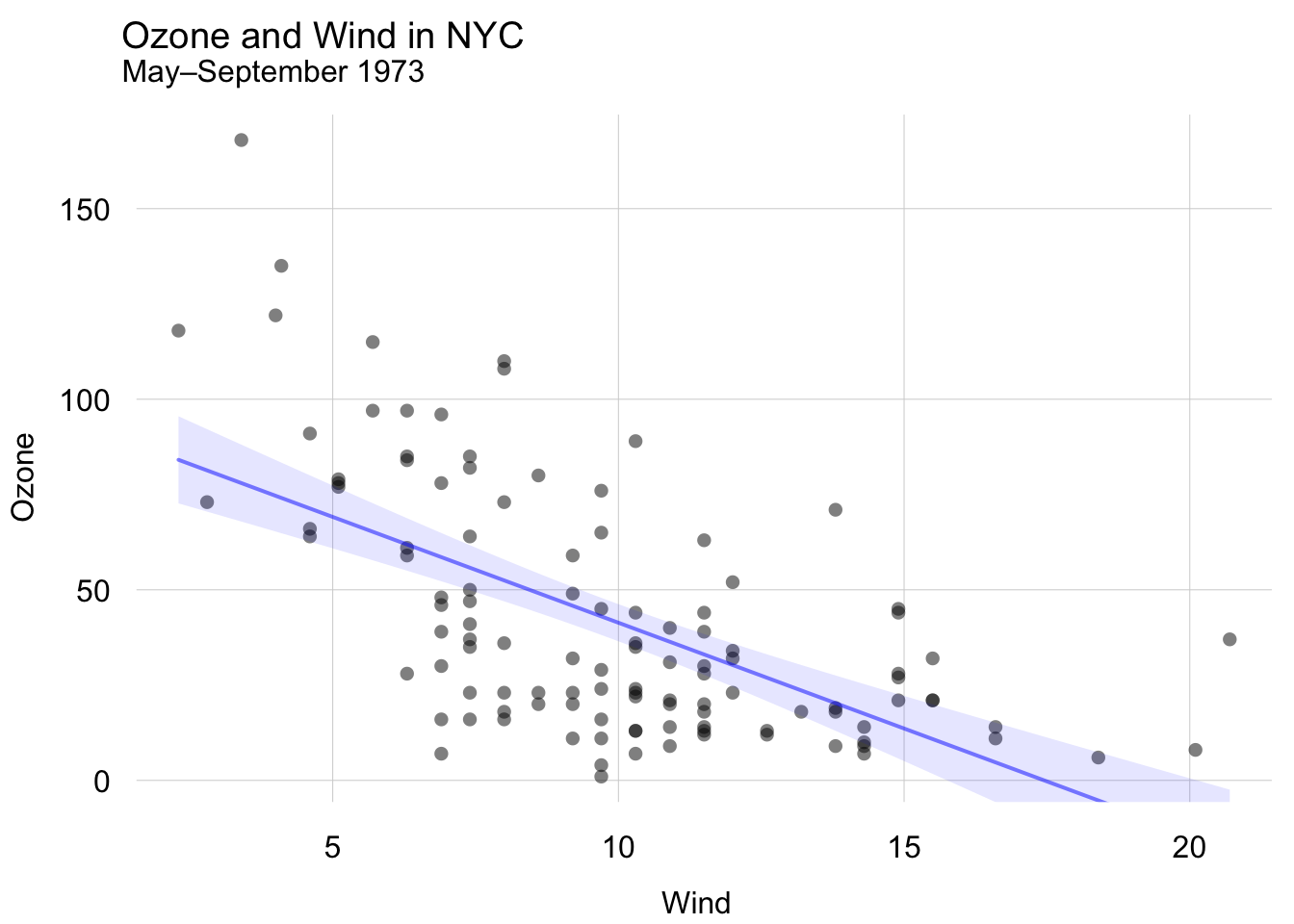
The base plotting system is a powerful tool, but it can feel a bit clunky at times. If you want to add more advanced features to your plots, consider using the tinyplot package. It is designed as a drop-in replacement with no additional dependencies, and it allows you to create more complex plots with less code. For example, the scatter plot with regression line from above can be created as follows:
library(tinyplot)tinytheme("minimal") # optionally set a themeplt( Ozone ~ Wind,data=airquality,alpha=0.5,main="Ozone and Wind in NYC",sub="May–September 1973")plt_add(type="lm", col="blue", lwd=2)
Load the penguins dataset from the palmerpenguins package and create a scatter plot of the bill_length_mm column on the x-axis and the bill_depth_mm column on the y-axis. Label the axes with meaningfully!
Recreate the scatter plot from Exercise 1, but this time display the points of the three species in different colors and add an appropriate legend. You can, for example, first create an empty plot with the argument type="n" and then use points() to add data points for the three species in different colors.
Inspect the ToothGrowth dataset (make sure to read its documentation) and create a meaningful plot. Use functions we have discussed in this session (i.e., plot(), hist(), or boxplot()) – of course, multiple plots per figure are also encouraged (using par(mfrow) or layout())!
Use the mtcars dataset and create a boxplot of the mpg variable depending on cyl. Which vehicles consume more or less fuel? Pay attention to the correct interpretation of fuel consumption in MPG (miles per gallon)!
Combine the following three plots in a single figure using the mtcars dataset:
Scatter plot of mpg against drat
Boxplot of mpg depending on cyl (see Exercise 4)
Histogram of mpg
Use a suitable arrangement of the three plots (e.g., using layout())!